
Every time PennEast releases a set of maps, they do it differently. Every. Single. Time. The result is that we see a very inconsistent view of the route over time, and it is frankly frustrating as hell.
The map I published a few days ago was the first to include construction work spaces, and also the actual Right-of-Way. In that respect it was a big improvement. But it lacked the center line, mile markers, and the 400′ “study corridor” mandated by FERC.
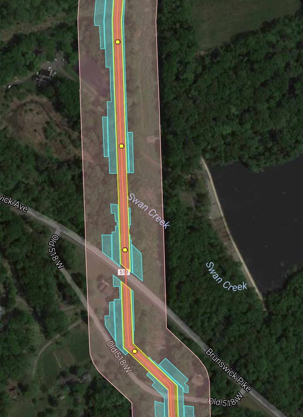
Fortunately (?), PennEast has been sharing different versions of their maps with different parties. In particular, the general public was given one set of maps (the one I distributed), and then municipalities were given a different map. I was able to combine the best features of both into a new map that is greatly improved. The links here and http://pipeinfo.org have been updated with the new map. Here it is:
https://www.google.com/maps/d/viewer?mid=1HseJh7rKferTARPMVWrOQvIIvb8
The map features include:
- All features are made semi-transparent so you can see what’s underneath them
- Pipeline centerline
- Permanent Right-of-Way
- Mile markers (clickable yellow dots)
- Construction areas (cyan)
- 400′ study corridor (shaded pink)
- Permanent above ground features (compressor stations, launchers, etc)
A sample is shown below:
Running these sites is getting expensive. If you want to help out with the hosting and other costs of running thecostofthepipeline.com along with pipeinfo.org, then please take a look at the donate page. Thanks!


Published by