
PennEast representatives sometimes seem almost mortally exasperated in dealing with the press and general public. They are constantly barraged with accusations of the company being bunglers, incompetents, deliberating misleading, and just plain not very good at their jobs. And PennEast reps can’t understand why this is. Why all the hate, people?
Well, tonight I was looking in some more detail into those IBA Avoidance routes. In particular I was double checking the alignment, which I know is off a bit here and there. I do that by changing the transparency of the PennEast map image back and forth from fully transparent to fully opaque, and seeing how the underlying Google map matches up to the PennEast map.
And in doing so, I remembered why it’s so hard to get the maps to line up exactly. The PennEast map is the most ridiculous map artifact I’ve ever dealt with. Here’s what I mean. Here is a closeup of the PennEast version of the “IBA Avoidance” area going around Baldpate mountain.
Map A – PennEast’s Extraordinarly useful Map

And now here’s the same thing in Google Earth:
Map B – Google Earth Version of the same location
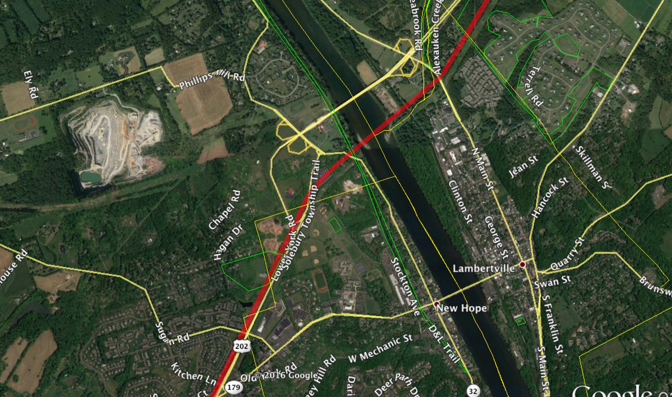
Yes, these two maps are showing the same thing! The blob you see on the left on PennEast’s map is in fact a Trap Rock quarry. The black line is the Delaware River. The beige-ish blob you see to the right of the Delaware? That’s Lambertville City! The beige line you see above the pipeline route? That’s the Route 202 bridge.
Oh yeah, and Google Earth has little things like city markers and road names!
If you look really closely you actually see many features are entirely missing from the PennEast map, such as several housing developments. It makes you wonder just how old the PennEast base map really is.
This is a microcosm of what people who deal with PennEast see every day. Mind-numbingly bad and useless information and materials.
Pat Kornick, you wonder why people hate your company so much? Look at “Map A” and wonder no more.

Published by